Bringing a Prewar Apartment into the Twenty-First Century
WRITTEN BY ALISSA SCHULMAN / PHOTOGRAPHY BY NICOLE FRANZEN
When working in a prewar building, people tend toward extremes: either preserve everything or gut renovate. For this East Village apartment in the historic Onyx Court, GRT Architects founding partners Rustam-Marc Mehta and Tal Schori found a way to reminisce on the past without compromising their modern vision.
“I would describe our relationship to time periods as an interest in a certain level of detail more than a specific quotation from an era or style,” says Schori. “We did not have fixed points of reference for a given room or element so much as an approach that calls for detail, articulation, and richness of materials.”
When the architects first saw the space, the apartment was holding onto an early twentieth-century floor plan, characterized by a kitchen hidden in the back and long hallways wrapping around enclosed rooms. They modernized it by opening up some of those walls, taking advantage of every square foot in the process. They swapped locations of the kitchen and the primary bedroom, creating a proper heart of the home with the kitchen, dining, and living rooms toward the entrance and a private space to relax in the back.
“The owners were looking for a home composed as a series of comfortable rooms rather than a single open space,” says Schori. “Therefore, one of the main goals to support this mood was making a number of changes to the space while improving adjacencies, shared natural light, sight lines, and spatial efficiency.”
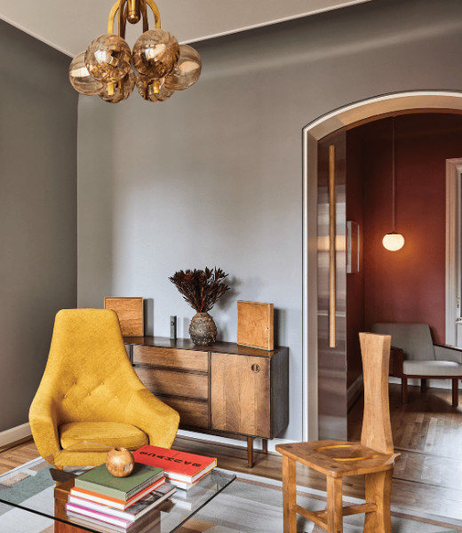
The entrance, a long hallway that recalls the original layout, looks straight through the kitchen, offering a wash of natural light down the corridor through the east-facing windows. Upon entry, visitors are introduced to the arched framing that Mehta and Schori used throughout the space. “The ceiling cove holds a special place for us for the way it both emphasizes the wall to ceiling transition and dematerializes it,” says Schori.
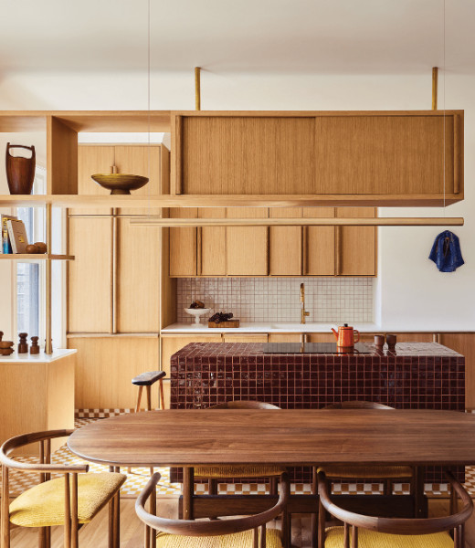
They distinguished the kitchen from the entry with low cabinetry, which wraps around the space to offer a sense of a room without necessitating structural walls. Inside, the blonde woodwork meets striking tiling. “We wanted the floor to celebrate pattern and color and pushed this further with a very sculptural block of color as the island,” says Schori. The kitchen walls go quiet to give the tilework space to experiment, and the counters follow suit.
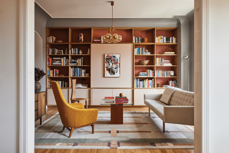
The adjacent dining area layers a slightly darker wood tone and ochre chairs—two shades that quietly carry into the vibrant living room. “While the sight lines are open from kitchen to dining to living,” says Schori, “a sense of rooms is clearly suggested with color, framing, lighting, and floor finishes.”
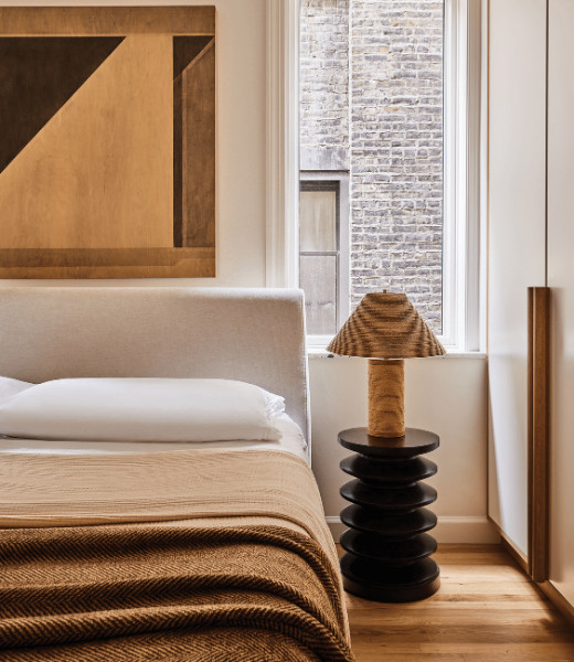
Conversely, Mehta and Schori closed sight lines into the bedroom, situating it as far away from the home’s shared spaces as possible. Here, they departed from their color studies to offer a peaceful space dressed in neutral shades of tan and cream. “The design of the bedroom was conceived as a quieter version of the millwork we used elsewhere,” says Schori.
It’s that persistent point of view—informed by the past, yet distinctly theirs—that elevates this home into the modern era. “We love that you can’t name the style or look,” says Schori, “that the design evolved from a love of materials and detailing and benefited from a lack of preconceived notions.”


