Historical Details and Original Artwork Guide This Layered Design
WRITTEN BY MARESA GIOVANNINI / PHOTOGRAPHY BY KARA MERCER
“I hold a strong belief that adding color to your surroundings equals adding warmth to your life,” says Seattle, Washington-based designer and owner of The Residency Bureau, Amy Vroom. “We have so much gray in the Pacific Northwest, I don’t believe a neutral interior does much to cozy up a home. I’m very passionate about layering color and patterns into your space to truly envelop you and create a cozy environment.”
That’s a guiding principle she took to this 1915 Tudor in Seattle’s University District. The 5,300-square-foot home was purchased by a neighborhood family with three kids who brought on Vroom to honor the history and their personal aesthetic. “My job was to bring together two very different styles—the clients’ love of midcentury elements within a beautifully traditional home. The key was to meld those two styles in a way that felt aesthetically organic, not forced, while at the same time giving it a young family feel,” says Vroom.
The color palette—which she describes as vibrant but livable, playful but sophisticated—was informed by existing pieces. “The clients had a lot of colorful artwork, so I pulled from tones that would work with some of the things they had. The blue tone was one we explored in the early rounds of design, and they both gravitated toward this color.” Blue millwork, painted Oval Room Blue No. 85 by Farrow & Ball, was also inspired by the home’s striking, original stained glass. “A common prescription for adding color is to keep things neutral and deploy colors with accents like pillows or throws. Here, we harkened from the lessons learned with the stained glass—bringing color to the bones of the home, not just the accessories.” Other soothing paint colors include Rojo Dust by Sherwin-Williams in the entryway and Setting Plaster No. 231 by Farrow & Ball in the sunroom.
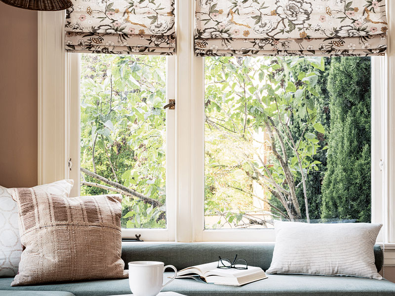
The sunroom, Vroom’s favorite space, benefits from custom, built-in sofas that create a playful nook. The homeowners’ weekly family gatherings guided (durable) material choices and conversational furniture placement throughout. In the living room, a plush sofa, vintage chairs, and stools with casters make entertaining a breeze. The dining room, anchored by a vintage teak table, accommodates ten comfortably.
While the seating choices provide physical comfort, generous and varied use of color, pattern, and texture create inviting spaces that put you at ease.
“Varying the textures and surfaces in a room is as important for having an interesting space as mixing up the colors and patterns,” says Vroom. “I tend to stick with one or two metal tones in a room (aged brass or unlacquered brass are two of my favorites) and layer in an array of materials. In this house, there are an assortment of textures and organic elements: a range of fabrics on the furnishings, chairs with woven backs or seats, vintage pieces with patinaed wood, wicker shades, turned legs, and interesting shapes. The combination of all of these elements makes the rooms feel cozy and complete.”
PATTERN PLAY
“Layering in various types of patterns allows your eye to explore as you’re experiencing a room,” says Amy Vroom, designer and owner of The Residency Bureau. “The scale and the color of the patterns and how they flow from room to room all work together, but they’re not all identical. That’s what keeps it interesting. Looking at the living room [in this featured design] for example, you have a slightly larger and muted pattern on the rug, whereas the flowers on the ottoman are more pronounced. The pillows have a much smaller scale pattern, and they each pull out tones in the artwork or the millwork. The muted rug carries through visually into the color and patterns in the sunroom, whereas the small-scale poppies in the dining room wallpaper complements the large-scale art.”
Photos: @_karamercer
Designer: @theresidencybureau
